
Fifty Digital: A New Brand Era
As we approach the agency’s fifth birthday, the time was right to develop a look and feel that befits our position in the industry. We wanted to create a unique, mature and confident brand that reflects the creativeness and pedigree of our company. The challenge was clear, design a new brand to stand out in a competitive industry that is rapidly evolving.
The anchor
The first thing was to create a bold, unyielding wordmark that would anchor our brand like a rock in stormy waters. Legibility when pixels are at a minimum is paramount when working in the social media industry and communicating the power of our brand was a must. We decided upon a tight block uppercase identity that fits both requirements.

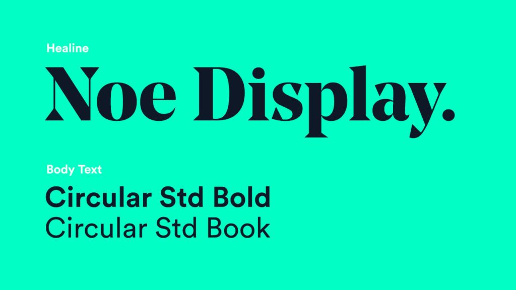
Finding our voice
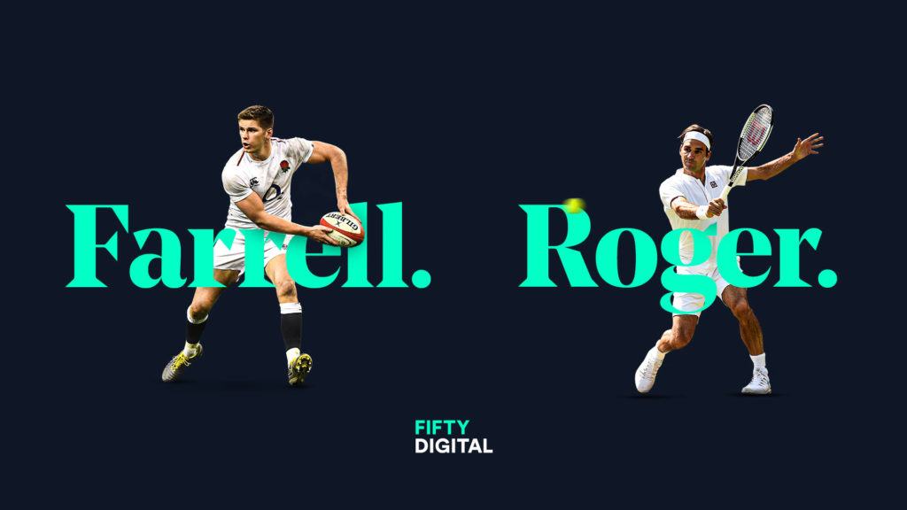
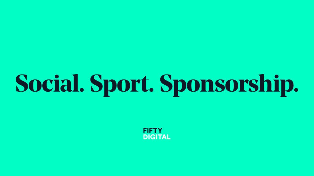
To stand as the masthead and expression of our brand, we chose a striking and confident display font to convey our tone of voice. Noe Display Bold conveys a sense of age-old wisdom mixed with a contemporary and trendy twist. To compliment this expressive display font, we chose Circular Std as our main copy font for clarity in communication and simplistic style.
Cutting through the noise
Designing the colour palette was not so much of a complete refresh as the rest of the brand, but more of an evolution of our existing style. We heightened and amplified our green to an Electric Teal to create a distinctive accent colour that cuts through the noise of a busy social feed. We hope this new shade of Teal will make our brand instantly recognisable. To counter this, we darkened our Navy Blue to a much deeper Space Cadet Blue. This provides a neutral base to lift the Electric Teal of the page and show off a vast array of client creative that may not share a similar colour palette to ours.

Ever evolving brand
With these basic building blocks, we have entered a new era in Fifty Digital’s company history which we hope will be as distinctive and prosperous as the first iteration of the brand was.


